The most fun an author can have is with your book cover! It’s one of my favorite parts to bring all the hard work of the inner content to life, at last. I was going to go a new route for this book! The art of commissioning a bespoke illustration required hiring someone that could appropriately capture my personal author brand alongside global anonymity so that others could simply see an illustration depicting a specific lifestyle. It was such fun to produce my latest cover and I found it fascinating how illustrators work from start to finish. I thought you might enjoy that too, along with the images to show the process I went through.
Author Brand:
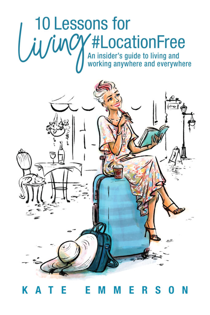
For my 5th book titled “10 Lessons for Living Location Free,” I knew I needed something totally different to mt previous 4 books. My own mug shot, as Kate, the ‘author brand’, had appeared in some form on all my book covers to date. But for this book, I had also interviewed 16 other amazing global nomads to include their perspective and lessons of life on the “road.” It was important for me to depict other voices, opinions, experiences of both men and women around the world, in different work and from a variety of countries, with all of us commonly being over 40. I didn’t just want another brand picture of me on the cover this time. I wanted a way to depict me in a more unique and universal way to allude to all digital nomads, wander-lust travellers and #LocationFree mavericks.
Last year I had worked with one of our authors to publish her inspirational memoir. My business partner Sarah Bullen and I work with writers all over the world and handpick one or two authors to publish. This author wanted to create a bespoke illustration for her book cover, and I had so much fun walking her through it, from researching and finding the designer, talking through conception to execution and finally seeing her book on sale in the Amazon store and holding it in my hands.
It felt right to try it for myself now.
Commissioning the right one:
The first trick when commissioning a bespoke illustration is to find the right designer, of course. They also have to be able to work within your budget, as it is usually more expensive than getting a regular designer to create a cover. Bear in mind the final illustration will still have to be incorporated into the actual book cover design, so there are in reality two fees to factor in now! You want to get the most bang for your buck and get the most experience for your available budget, right? My tip is to do some research on other books that you love out there, (be it covers or content illustrations), look at illustrators/designers you follow on social media and ask other authors in your network for their recommendations. Then, go and do your own deeper-dive research. Ultimately you want to narrow it down to three illustrators that you resonate with, and then go about getting quotes.
You have to love their work, their whole vibe and the quality of their work ethic, as well as availability time-wise and budget. It all matters.
I was lucky to have interacted with three amazing illustrators last year, and so I went back to re-look at all of their work and finally chose the one I had worked with before. Her work still seemed to have the best fit for me, I had first hand experience though the other author AND she was able to slot into my very tight timelines. An incredible talent called Shannan Taylor who owns Muse and Doodle. I was publishing this book from edit to final finish in 28 days and she agreed to match my crazy deadlines.
I am NOT a designer by any stretch of the imagination, but I do have bold opinions about things, especially when it comes to my own brand, business and books. Every other book out there to date about #LocationFree living or the digital nomadic lifestyle usually has some bad version of a laptop and the world globe on the cover, or a beach and palm tree and that just wasn’t going to cut it for me!
My suitcase kept whispering to me for this cover!
The concept:
When you have commissioned your illustrator, it’s time to talk through some ideas with them. If you are not a designer you don’t want to be too in control of this process, as you might sway them to your limited thinking. You have hired them for their creative brain after all, right? Let them ask questions and find out what matters to you. They have their own process they follow, so trust them! I had considered some ideas for a possible concept, but until she asked me some things, I hadn’t even thought about them. So when I said I spend a lot of time writing in cafes around the world – she asked – what country, beach or town, inside or outside, what do you drink, etc. I even had to go and find the “look and feel” of different street cafes for her. Go and look at some design elements she showed me to see what I did and didn’t like. I had always loved any artwork with a city skyline – we came up with the idea to use different iconic buildings to depict the whole world rather than ONE city per say. Think Paris next to London next to New York. Oh my – yes yes yes!
I have travelled with a suitcase for five years. Literally! That was important to my #LiveLightLiveLarge motto. She asked me my favorite colours, what I wear, some of my favourite outfits, etc. I sent her some of my brand photographs I love, and we spoke about cats, coffee, wine and the world. But it was very short back and forth on Whatsapp mostly, with dropbox for viewing scamps and ideas as they arrived.
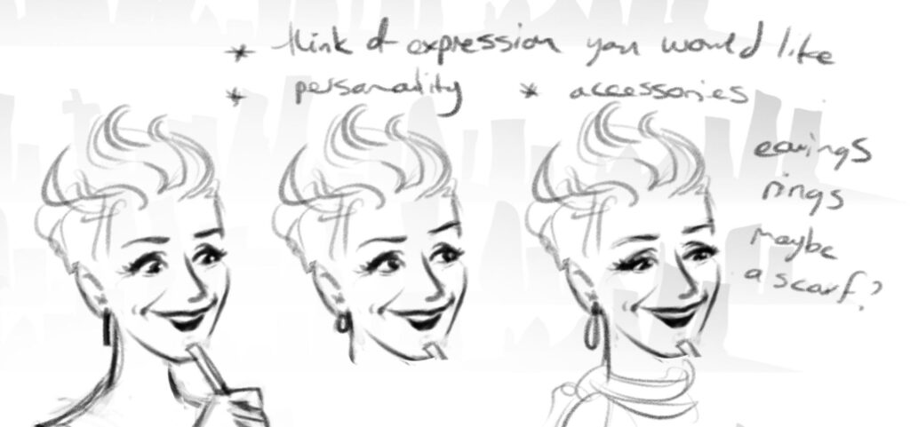
She very quickly came back with two initial ideas, similar in essence but totally different in energy for me. They are called “Rough Sketches” also known as “Scamps” and I instantly loved the second one on the right, below. My brand motto is all about lightness, laughter, energy, movement, swift action and so the one with “me” sitting down felt too stuck and solid energetically. Do you see that too? The one sitting ON the case felt filled with oodles of possibility; like waiting for something exciting to come along. It energized me. I also preferred the quick capturing of my face pondering life – the other one felt too cartoonish and casual.
Even though it wasn’t directly to depict me and rather to have an air of universality, it certainly needed to be ‘me’ at the same time. I couldn’t believe how fast she sent through these two first ones! The joy of working with a pro!


After I chose the concept of the upright suitcase, it was then about the next layer of detail. I also didn’t love the skyline concept behind the character. She wanted to get my expression and body position next. Angle of the gaze. Smiling or not. Direction of legs, etc.
What I really wanted to achieve was that if someone doesn’t know me they would have no idea who is on the cover – they would just see a woman on a suitcase, but if you do know me, you absolutely know that I am sitting on that suitcase pondering life, love and travel. I love both the recognition and the anonymity she managed to portray.
Perspective and size
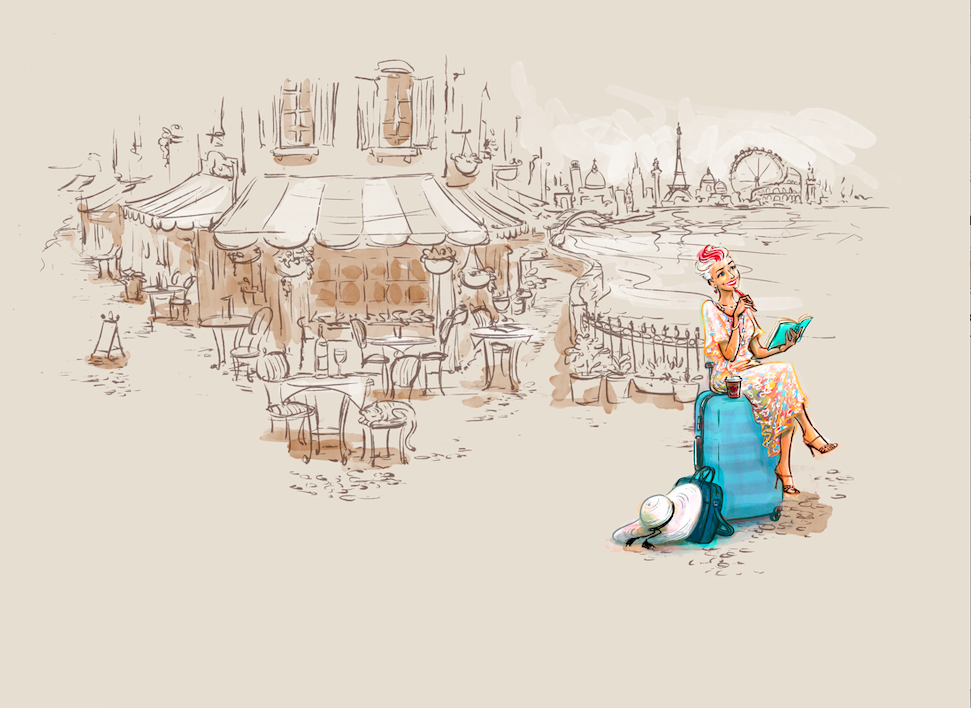
For the next scamp, I still adored how the cat walked behind the suitcase, with his little tail peeking out, but we felt something was ‘off’ with the size of the suitcase on the left image. She decided to try increasing the suitcase height so I could sit on top with my legs swinging on it. See the second image with a different face angle too- It instantly felt another notch “lighter.” We ultimately decided to leave the kitty for somewhere else on the image. Oh, I was sad to see him disappear in the next stage but the perspective of the image required it. I knew a kitty HAD to appear somewhere, and she came up with another brilliant idea. I also love coffee and wine – how on earth do we have both? What about my beautiful white sun hat, and teal computer bag? Less is more – but what is important to portray? Pile of books or not? So many things to consider!


HEELS! I always wear heels that add height, colour and funky kind of class. I absolutely knew from the very first image that I am not a closed-toe kind of gal and the “converse” shoes felt too casual for the cover. So suddenly there appeared a pair heels that I own – sexy, black strappy heels with multi-coloured crystal studs. See Yoga Pic Below to check those babies out! Everything is “alluded” to in the image, rather than being too obvious. Next was hair – how short at the sides, what pop of colour for the stripe in the front? Ever since I went silver at age 38, I have had some stripe of funky colour. NO grey rinse brigade for me! Earings and necklace?
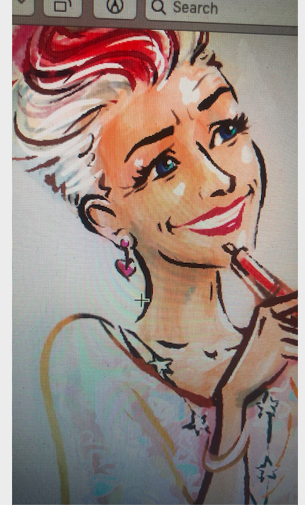
She managed to emulate the two items of jewelry I wear 90% of the time – heart-shaped silver drop earrings and a long silver necklace with stars studded along the length. But again – no one else would really “get” that unless I told you! I really love that about this cover. You can see those in the close-up face shot below.
The entire cover illustration
When the image of me was signed off, it was time to create the background setting for the rest of the look ‘n feel.
I squealed with sheer delight when I opened our joint Dropbox folder the next morning! OMG. Squeal squeal. I was in awe and sat there grinning from ear to ear. Complete with “me” in the foreground, against an explosion of a global, waterside café in a sepia wash with line drawings. I mean, look at all those buildings showcasing global travels…! Plus there was suddenly a gorgeous dress – and it took me a while to realise what had inspired that fabric – my own kaftan bought when I worked with the YPO in Saudi Arabia that she had seen in our dropbox folder! See below.


Brand alignment
I LOVED IT – and at the same time I had to tap into the fact that my brand is all about simplicity, minimalistic, decluttering, lightness and space. The gorgeous background scene was just waaaaaaay too busy for my book cover. Covers have to speak volumes in terms of the actual genre and the essential message of the book and also work as a thumbnail image on Amazon / online. I double-checked my thinking with my awesome, long-standing designer, Megan from Megan Barber Designs who would be pulling it all together and designing the full final cover. She 100% confirmed my initial thinking -too busy for me and what the book portrays as its core message. Darn.
Shannan was SO easy to work with and never took anything I said about the design personally. We discussed how could we pare it down but still keep the look and feel elements. Then, off she would go to re-draw. We went back and forth about what made it cluttered.
Was it simply the placement of the water and what if it was on the opposite side of the image? No.
Was it too much busy-ness in the café scene? Yes.
Was there just too much of the background in general? Yes.
But did I love the skyline? Oh yes!
Sleeping kitty? Definitely yes!
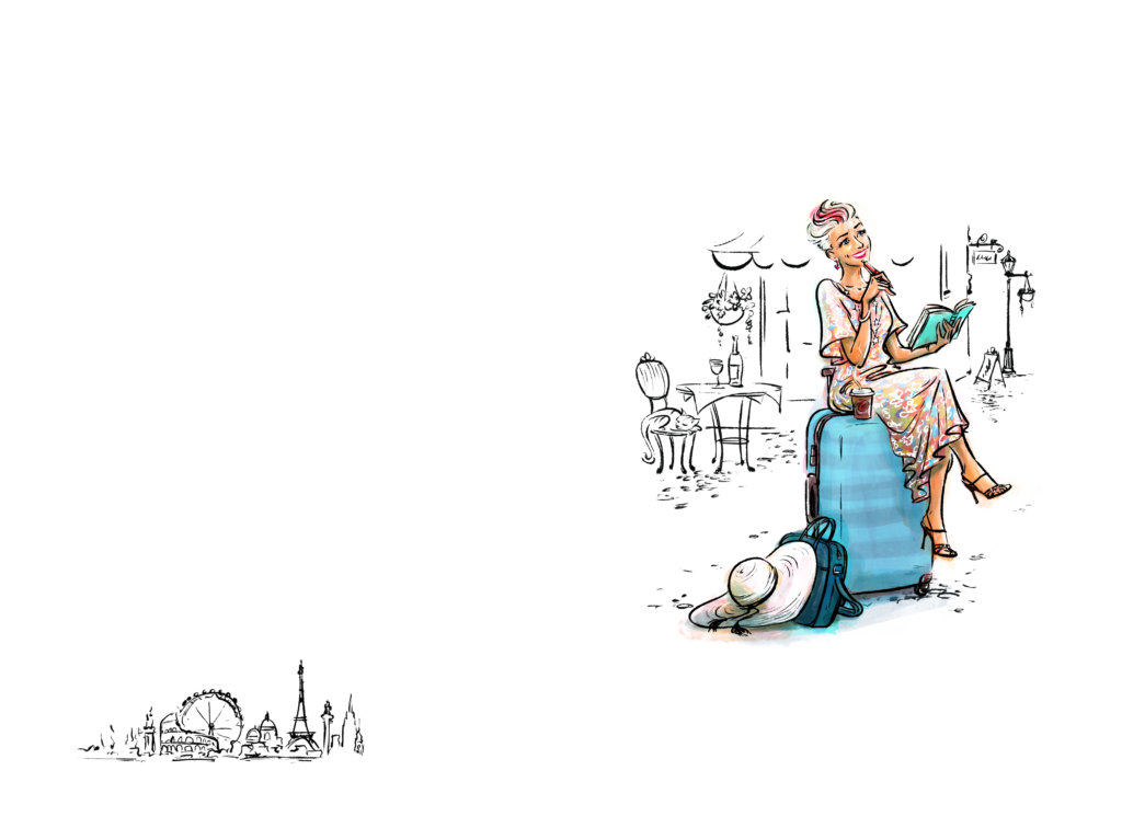
So for about 48 hours we went back and forth and then realised we could take the elements of the skyline buildings and use them on the BACK cover eventually. The cat could still appear lazing on the chair, the background could be all B/W line drawings on white to reduce the visual noise, and we totally pared down the café elements. Below are the final elements we went with – clean and simple! Spot the kitty, vino and coffee! Also, the way Shannan “doodled” it, it could be any cafe anywhere in the world, rather than location-specific, right?!
Maybe you will meet for coffee in Greece, Italy, Spain, Canada, Franschoek?
I was, and am, totally smitten with my cover!!!
Power of feedback:
I was about to sign the image off when I paused for a moment and showed it to Sarah, my honest business partner I mentioned earlier. While I was knee-deep in publishing this book, she was on a massive deadline ghostwriting a celebrity memoir. I had not shown her anything up to that point. She said, “Kate, this is absolutely amazing BUT you just look too young. You and all the other nomads you interviewed are all over 40 – but ‘you’ look 20.”
Oops – I hadn’t even realized this, as I was just so starry-eyed. Some appropriate lines were added to show my realistic laugh lines and creases, but still keeping the whole look light and bright. It just made it more authentic! Below is a close-up screenshot:) Great way to see the heart and stars I told you about too. The power of objective feedback from others is vital in any book process! To that end, we even have what we call “Feedback Friday’s” for writers in our community to get objective eyes.
Shannan gave me all the final versions required for the designer, payment was made and the next design step kicked in.
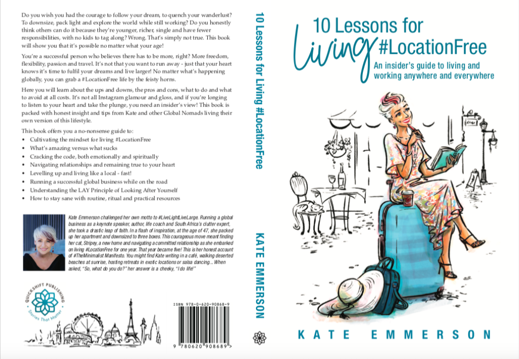
Final book cover
Next, I moved onto the elements I understand really well, that of the final cover design. There are always two parts to consider for a book cover
1. The eBook version that only requires the front cover image
2. The printed paperback version requires a full back, front and spine for the cover.
I knew the eBook cover could NOT contain the skyline buildings element and was cool with that. Megan sent through several initial options of fonts and design for the title, subtitle, and author name. I loved 90% of them, which made it a bit harder to choose. Go back to what matters – the fonts and design have to elevate the illustration and speak to your brand elements, but also be super legible and speak to the buyer/reader!
It all has to work as ONE beautiful cover that tells a story.
I loved seeing the skyline elements come to life on the final cover design, but nothing beats getting the first book IN your paws and being able to see it in front of your eyes. For me as an author that is one of the best moments in life. Unwrapping your book for the first time!
I have had such wonderful responses to the cover – everyone just loves the energy it gives off. I am so pleased I spent the time and money gifting myself this- it was fun and I feel it showcases the content of the book alongside my brand motto. If you know anyone who wants some inspiration to pack up, live light, and figure out how to work around the world, you can grab the book here on Amazon and 10% of all sales are donated to the wonderful company called The Future Forest Company, and all sales help plant trees on the island of Mull, West Coast Scotland
What are YOU going to do with your book cover to help it fly off the shelves when the time comes?
Fancy joining us on a Writing Retreat?
If you want to join us on a writing retreat somewhere in the world, take a look here. We host them in Greece, Italy, Spain, Scotland, South Africa and Italy – yes, we are gearing up for some safe travels this year!
Hope to meet you soon,
Love Kate
P.S What is a scamp?
Well to put it simply, a scamp is a drawing, or sketch of an idea. These, are created to bring to life and visualise your idea and share them with others. Now a scamp can be a quick idea you had in a coffee shop, a simple doodle on a handkerchief, or a full blow colour work of art. Scamps are used in the industry to communicate an idea, and depending on how much you want to communicate you can draw your scamp accordingly. My experience with scamps is to draw out a design, or composition where it is passed on to other design professionals like a photographer who will use the scamp as a reference to get the right angle or a picture close to what I want that will work in the main design. I may have to sketch a magazine layout, or paper fold idea to get sign-off from a creative director or client. Thanks to https://garethdavidstudio.com/
